Disaster Relief Dashboard
Overview
🤔 Problem: Flood experts need to view a wide range of data from multiple sources as a natural disaster develops in real time.
💡 Solution: An analytics panel that helps storm experts compare and contrast datasets by source, relevancy, and flood category so they can make quick, well-informed disaster relief and preparation decisions.
✅ UX research and design completed alongside Kaitlyn He & Paul Tran @ Pacific Northwest National Laboratory↗
How might we ease the process of finding and analyzing flood data so storm experts can make informed relief decisions during a developing natural disaster?
Research
⛈️ My team interviewed and worked alongside storm experts and analysts
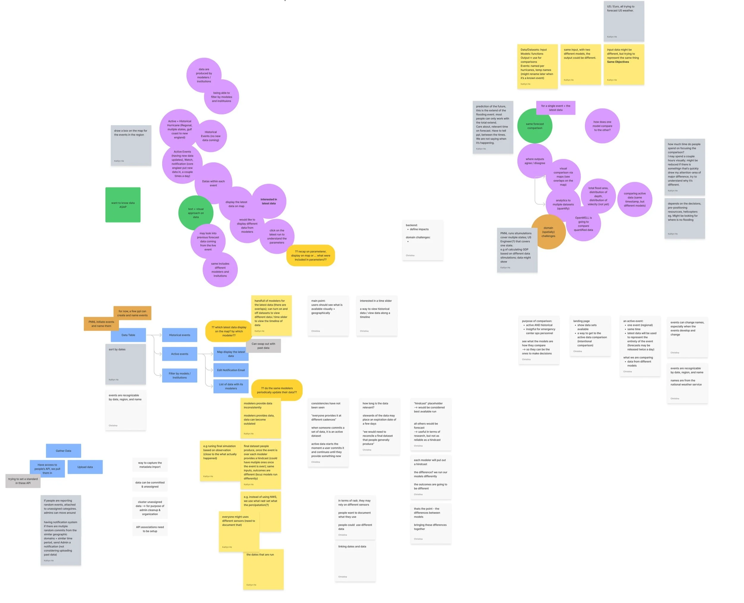
🔎 We discovered storm experts receive data from multiple sources, but each data source tells a different story and comes at different time cadences during a developing disaster. It can be confusing! Analysts need help finding related information from different sources, and then comparing and contrasting that information.
💬 Learning to speak like a storm-expert was key to this UX project. Here’s the terminology:
-
A developing storm
-
A data prediction for an event/storm
-
An organization or group that provides forecasts. As time passes, a data source will provide new forecasts for the same storm. So, each model will have multiple forecasts
-
A visual model commonly used in analytics to perceive overlapping events
-
Helps analysts understand changing water depth levels
Wireframes
✏️ Pencil and paper is the way to start
🏗️ These low-fidelity frames begin to hone in on the forecast panel, the beginnings of my major contribution to the final design
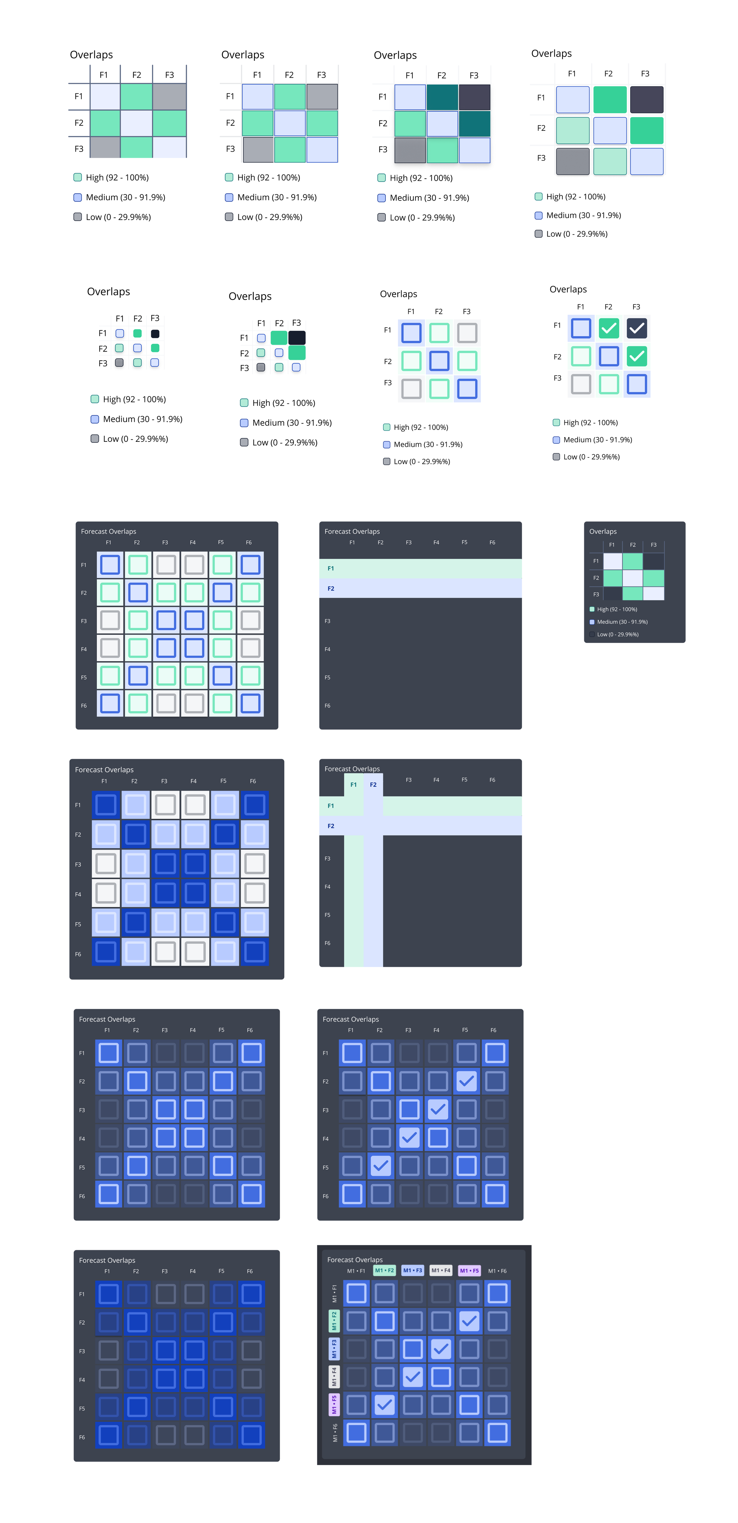
🖼 The transition from medium to high-fidelity wireframes shows a major change: emphasis on the matrix table (and finding the best way to include it in our team’s pre-existing design system)
A matrix table indicates the amount of overlap (high, medium, or low) between flood depth data from a variety of forecasts
Matrix tables help users discover which forecasts are the most and least similar to each other
Users are already familiar with using matrix tables when they compare storm forecasts - which is a major plus. If your user already understands something - stick with that.
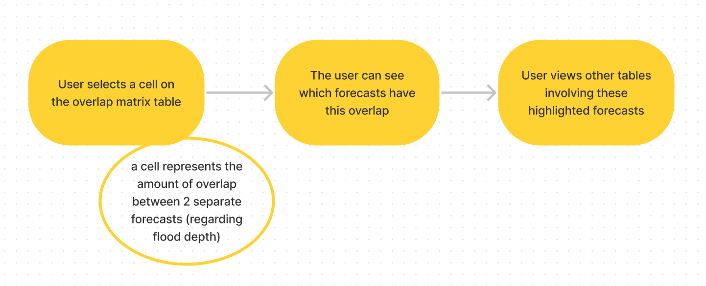
📊 When the user discovers and selects unique data in the matrix table, they need to see how this data connects to other analytics models on the dashboard.
🧩 Each piece of the dashboard will influence the other pieces. To make this clear, I designed labels that can be identified by both color and letter (for accessibility).
🧩 At first, I kept separate data pieces on separate dashboard cards.
👓 However, users needed to see forecast data in the clearest way possible: right next to each other. To fix this, I made sure all forecast groups with non-visual data were all placed in the same table row (no longer in separate tables.)
Final Design
🎁 Ta-da! Handoff time. Here is the mockup I shared with my team lead. This mockup also includes two of my coworkers’ data tables, Forecasts Timeline and Information, and leaves space for additional dashboard cards to be added later.
Storm experts and analysts can now:
✅ Make quick, well-informed decisions in the face of a natural disaster — without the confusion of sifting through many different datasets arriving at many different times
✅ Compare and contrast datasets by source, relevancy, and flood category as a storm develops
✅ Choose to focus on as many—or as little—forecast groups as they would like
✅ Visually understand one dataset’s role in the midst of a larger group of data
What I learned
💭 Confusion should not inform design decisions. We paused our process to ensure we understood all the common (and hidden) terminology in the disaster relief community. If we had not cleared the confusion, the product (and its users) would have suffered.
🔁 Be willing to iterate. Iterating my way through the flood depth matrix model helped me collaborate, continue to learn about the user, and come up with a wide variety of options.
✏️ Good typography helps a user navigate information and keeps a design squeaky-clean
🧐 Stay curious, listen well, and ask questions. Repeat.


